
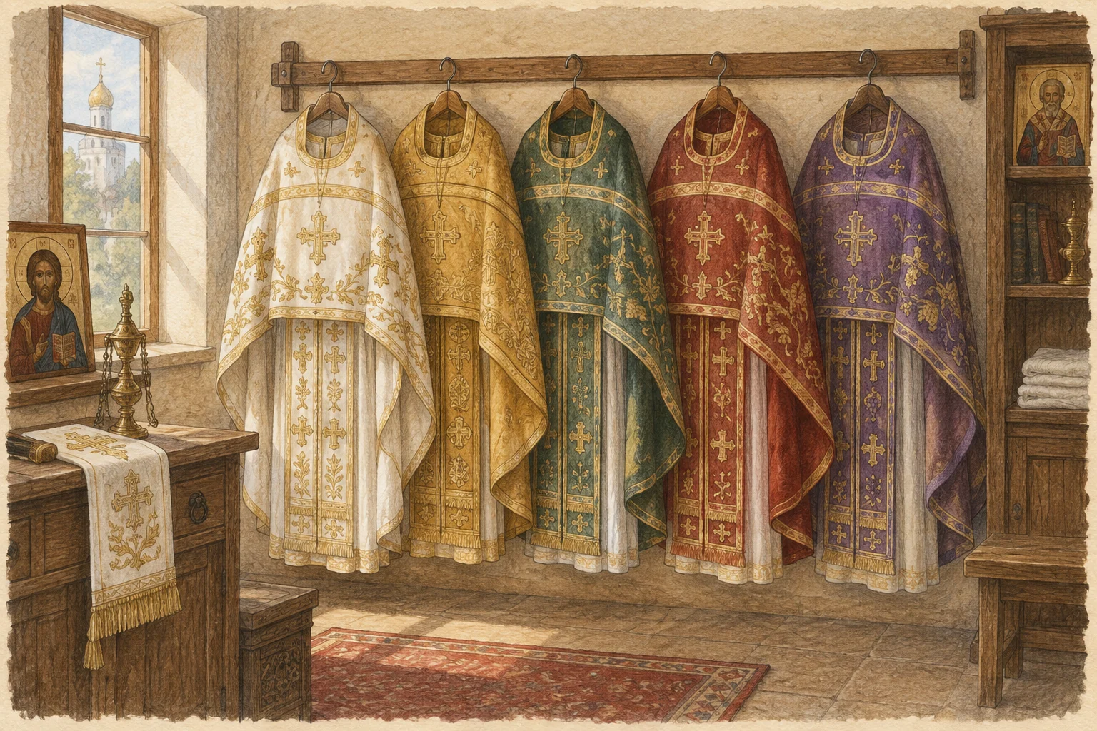
Vestment colours help draw attention to the character of a church day, but they do not replace the calendar or the words of prayer. Orthodoxy has no single colour chart applied identically in every local Church. The examples below describe common Russian practice; another parish or country may make different choices without compromising the faith.
Light and festive colours
Gold or yellow vestments are often seen on Sundays and commemorations of bishops and apostles. White is associated with light and is used for several feasts of the Lord. It may also appear at Baptism and funeral services: white does not mean ordinary happiness alone, just as dark colours do not mean despair.
A photograph of a priest in white therefore cannot identify a feast with certainty. The date, readings and hymns are also needed. Colour works alongside these, not in their place. This matters when a photograph is published after the event or reused from an archive.
Red, blue and green
In Russian practice, red is especially familiar during the Paschal season and on commemorations of martyrs. Blue commonly accompanies feasts of the Mother of God. Green is seen at Pentecost, the Entry into Jerusalem and commemorations of monastic saints. These are brief landmarks, not a foolproof method for identifying a service from a single image.
One colour may carry more than one association. Red can recall a martyr's witness as well as the triumph of Pascha. It should not be credited with magical effects or treated as making a prayer more powerful. Vestments belong to worship, not to a system for controlling feelings or events.
Dark vestments and fasting seasons
Dark shades commonly accompany penitential services, while purple or dark red may be associated with the Cross. The statement that “everything in Lent is always black” is nevertheless too simple. Sundays, feasts and particular days have distinct characters, and local practice reflects these in different ways.
Dark vestments are not an instruction to perform sadness. Repentance means turning towards God, not losing hope. Equally, light vestments do not require someone to hide grief. A person can bring sorrow to a festive service: the liturgical calendar does not erase the reality of their experience.
Why differences are possible
The history of worship reveals changes in colour customs even within one tradition. Established local practice, ecclesiastical direction and the sets available all affect what is used. A small parish may have a limited wardrobe. This does not make its worship less complete or justify ranking communities by the richness of their textiles.
Visitors do not need to match their own clothing to the clergy's vestments. Appropriate, comfortable clothing and attention to prayer are sufficient. To understand what you have seen, ask afterwards, “How does today's colour relate to the feast?” An explanation of the actual service is more helpful than an argument over an online chart. When deciding when to visit, use the parish schedule: a photograph's colour cannot tell you tomorrow's commemoration or the time the Liturgy begins.
Lighting and image processing may make the same set of vestments appear red, burgundy or purple on a phone screen. Debating an exact shade from a photograph can therefore produce false certainty. Basic colour groups are enough for an introduction; identify a particular service by its name and a local explanation rather than by the camera's colour rendering.
How to read a colour chart
Begin with the full name of the day and its notes, not just the coloured cell. The linked chart gives green or white for the Entry into Jerusalem, for example, and blue or white for the Meeting of the Lord. The reference itself therefore describes more than one option within the practice it presents. Copying only the first colour creates a stricter rule than the source actually states. Reading the whole entry avoids turning a useful guide into an inaccurate absolute.
Notice wording about the period of use as well: an entry for a feast itself is not always identical with one covering the following days. Even a detailed chart does not replace the responsibility of those preparing worship. For a visitor it is a learning aid, connecting what is seen with the calendar. For those serving, the choice of a particular set belongs within the accepted arrangements, not a vote based on the most widely shared online image.
Liturgical custom and personal preference
You may enjoy blue and find black unsettling, but that does not establish that one service is spiritually suitable for you and another is not. Personal associations and liturgical use are different questions. If dark vestments cause anxiety, find out the name of the service and what its prayers say. The shade alone does not announce that a disaster has occurred or predict events for the people attending. Understanding the occasion gives a firmer basis than reacting to the colour in isolation.
When preparing a parish report, identify the feast first and mention colour afterwards as an observed detail. Do not infer the date from a photograph or claim that every Orthodox church looked the same that day. Before donating fabric or a complete set, ask about the need, measurements and material. Choosing a shade from a general chart does not ensure a useful gift: the parish may already have that set while lacking something quite different. A practical conversation makes generosity more likely to meet an actual need.